Paradox Interactive
keeping brand loyalty for a community at the top of its game
purpose
Paradox Interactive is a leading video game publisher known for grand strategy and simulation and titles such as Europa Universalis, Crusader Kings, and Stellaris. Their community is centered around sharing developer updates, receiving user feedback, offering support, and a direct method of communication to their fans.
To offer a space for their fans and deliver the content they needed, Paradox’s community needs had long begun to surpass what vanilla XenForo software could deliver. The community team at Paradox had an incredible passion to improve and grow and were attentive to listening to the needs of their users. Audentio was asked to modernize their forum interface while keeping within their brand guidelines, upgrade the forum software, and product consultants on community strategies.
services
- ui/ux
- community development
- community strategy
- migration
discovery and goal alignment
the challenges
At the start of our partnership with Paradox, our team aligned with the technical director, community leaders, UX designer and other stakeholders to clarify any questions, plan a roadmap, and keep in mind the goals.
The project was large and considering Paradox’s ecosystem — forum, mods, wikis, and marketplace — there would be design and technical intricacies in getting them to integrate better. We were approached to handle their community and wikis with a full redesign, forum software upgrade, community strategy, and migration.
the goals
The community leaders of Paradox are extremely passionate and attentive to their users. The community has become a space for Paradox fans and a way for their team to have direct communication with their players. It’s an invaluable resource and because of that the goals were clear:
- Prioritize the UI/UX to be consistent with Paradox’s brand guidelines and increase the utility of the forum
- Highlight the resources that Paradox offers — recommending wiki articles and mod recommendations within the forum
- Players regularly read developer updates in what they call ‘Dev Diaries’. It is a large draw for a lot of fans and critical to make them better highlighted and easy to find
- More of a game presence into their associated forums
product design for a game ecosystem
designing a ui
In working closely with the community leaders and UX designer of Paradox, our design team became familiar with the design guidelines and UX standards of the Paradox design. Overtime with their large ecosystem, the design language had become inconsistent between different properties. There was an initiative started by their in-house design team to unify the language across all properties, the community and wikis included.
elements of style
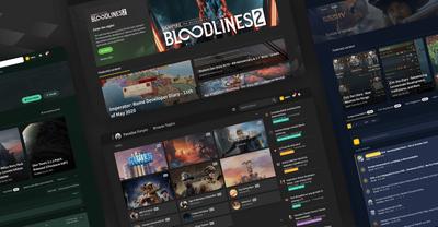
With guidelines in place, our team designed a community that offered featured content like the Dev Diaries to be front and center on the landing page, a consolidated forum list that highlighted game cards with imagery, and certain measures to improve content discovery — top navigation tabs to switch to trending and Dev Diaries, a forum search experience, and filtering.
Long-term members can be adverse to large changes and to ease the transition to the new format and interface, we also implemented a ‘classic’ theme that paid tribute to the original theme but still with the upgraded forum software functionality.
bringing game hubs to the community
building a space
The existing forum structure had indvidual forums for each game title, a good practice in funneling the relevant fans to their favorite game. Although, it had become hard to distinguish these game forums from each because they lacked any branding. Each Paradox game title has their own game art, imagery, and colors associated with it and we wanted to utilize this pattern for the community.
This evolved into the idea of 'game hubs', a space that was personalized to the branding of the game and offered a better way for fans to engage with that game's content.
making wikis responsive and easy to maintain
improving the wikis
In tandem with the community update, we worked with Paradox’s wiki team to establish a new look, update their software, add forum integration, and moving forward have wiki management handled by us. The existing wikis had remained mostly unchanged from creation and were non-responsive so our priority with a design update was to code the new themes to be optimized for mobile.
Through iteration, we eventually landed on a wiki design that introduced a main navigation that was in-line with the main site and emulated the different game brands.
listening to the community and ongoing strategy
community survey
After we rolled out a successful go-live with the community and wikis, we wanted to assess how users felt with the new experience. With Paradox’s community leaders, we conducted a user survey that ranged from topics of overall satisfaction to usability. Overall the response to the new forum and wiki update was a step in the right direction.
Content discoverability had improved and the prevalence of Dev Diaries and the new features were well-received. A comment from one of the responders:
“I have used the forums for more than a decade and believe the current set up is the best it has ever been. It is very easy to keep a track of the threads and conversations I am interested in.”
12%
15%
path forward
After we rolled out a successful go-live with the community and wikis, we wanted to assess how users felt with the new experience. With Paradox’s community leaders, we conducted a user survey that ranged from topics of overall satisfaction to usability. Overall the response to the new forum and wiki update was a step in the right direction.
Content discoverability had improved and the prevalence of Dev Diaries and the new features were well-received. A comment from one of the responders:
“I have used the forums for more than a decade and believe the current set up is the best it has ever been. It is very easy to keep a track of the threads and conversations I am interested in.”
community update 2.0
a new design language
As partners, we’ve handled community management, software maintenance, and continued rolling out features for the community and wiki as long-term partners. A large portion of that has been a focus on Dev Diaries and helping implement a new design language for the community.
dev diaries
To help in making Dev Diaries as accessible as they can be, we’ve implemented certain UX features:
- Top-level navigation tab for a Dev Diary landing page
- On the landing page which is a listing of all Dev Diaries, users can filter by game
- Featured content cards throughout the community highlight official Dev Diaries and any developer or staff announcements
- While in a forum, the ability to toggle only seeing developer responses

Working with Audentio has been an absolute pleasure. The team is very well versed in the latest tech and are great communicators and strategists. Their contribution in the development of the forums and wikis at Paradox has revived the excitement of the users and the content creators alike. I would highly recommend their services for anyone looking to revamp their community platforms and strategy as a worthy partner.


