XDA Developers
modernize and streamline one of tech’s largest communities
purpose
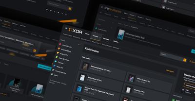
XDA Developers is a community founded by developers for developers with an interest in Android mobile software. For two decades, the community has been industry leaders in tech and the largest global Android resource by offering articles, reviews, and a community space for developers alike to engage and receive support.
The community continued to grow to over 10 million users but with growth can come certain pain points. XDA Developers had started to outgrow their forum software and with it a modern look. That’s when we began our partnership to improve the look and feel of the community, upgrade their software, and safely migrate their data.
services
- ui/ux
- community development
- integrations
- data migration
discovery and goal alignment
the challenges
Historically, XDA Developers has been one of the largest phone communities globally in matter of traffic, members, and amount of content. In terms of content, there were 78 million posts and 3.5 million threads at the start of the project.
Early in our partnership, for both us and the client, we wanted to lay out a very clear roadmap to address the goals and the challenges. The two largest challenges were 1) the data migration and 2) the UI/UX for a better user flow.
The data migration in question was the largest concern. To be conscious of server limitations, minimizing downtime, and safely and securely moving that amount of data was a monumental task.
The next challenge was finding a better UI/UX for a community of massive scale in terms of number of forum nodes and threads. Content discovery had started to deteriorate and their current forum software was no longer aiding them but hindering them in moving towards more modern trends.
Before the upgrade
After the upgrade
the goals
Identifying the challenges was the first step in setting our goals for the project and with close collaboration with the client, we had a defined roadmap:
- Streamline data structure organization to improve content discovery
- Move to a more scalable and extendable forum software like XenForo 2 that will also help improve performance and security
- Redesign the UI/UX of the community to improve user flow and content discovery
- Introduce gamification with a leaderboard and achievements to increase engagement.
designing a community for better usability and scale
community design
Our visual team set out first to put together a moodboard and onboard the client early in the concepting phase. With a long-standing community, it’s important to not alienate current users who may be adverse to change. The interface shouldn’t be updated for the sake of being modern but one that focuses on better type hierarchy, legibility, whitespace, and brand-ability.
Together with the client, we were able to find a balance by keeping the iconic brand orange, emphasis on device imagery, and really leaning into the Google Design standard as this was an Android community.
content discoverability
After the exploration phase, the new interface could begin to take shape as we planned out key experience improvements. A large proponent of the design phase was putting in measures that could improve content discoverability. As this was a mobile community, conversations would migrate to new device releases, most popular devices, and top manufacturers. That left a lot of areas nearly inactive as the devices moved to “end of life” status.
Following the natural progression of conversation, we designed the forum homepage to feature trending topics at the top, built with an algorithm we engineered, top manufacturers and devices. A tag list in the sub-nav is a flexible way to quickly add and remove hot topics as they come and a topic list in the left canvas also aids in narrowing down where discussion is happening.
exploration phase
Like any design phase, there was iteration in getting the right content hierarchy, brand elements, and legibility working together. We experimented with color palettes, brand illustration, and node structure. Ultimately, a dark color palette is best for a content-rich community and illustration was removed to focus on the utility of the site but it was all necessary and fun experiments.
building a performant and scalable community
laying the groundwork
It was a full team effort from our developers in making this project become a reality. We’ve been accustomed to developing XenForo communities but XDA Developers was unique in their complexity — helping with SEO, porting over existing add-ons, building a trending algorithm, restructuring their node structure, and paying critical attention to their performance.
We also introduced gamification with leaderboards and achievements that had it’s own nuances in getting to work with the scale of the community. Our development team worked extensively in the details of delivering an optimized, fluid, and clean experience to the users that improved utility. Styles Code
optimizations
Ahead of go-live Jake, our lead backend developer and systems admin, worked on optimizations to page load times — not including JS or CSS —and below are the results. The left is what the original was and the right is what we were able to get it down to.
data migration to the masses
transferring the data
Identified as an early challenge, our team did a test migration in the discovery phase. This helped to reveal any anticipated issues — attachments being one — what questions we may have leading into future test migrations, and a way to plan accordingly for solutions.
We ultimately did several test migrations ahead of the official go-live date and had migration support with another system ops. Our goal was to safely migrate the data, minimize the downtime, and ensure there were fallbacks in place in case of issues.
When we were close to doing the final import, we switched the forum to a read-only state so the forum was still accessible to users wanting to read past content. Our team was on full support for the go-live date and overall the release was succesful and couldn’t have been possible without the close collaboration of client-side systems and devops.
a native community app
mobile-first community
XDA Developers were using Tapatalk previously, an application that allows online communities to be more accessible on mobile devices, for their official app. There were some growing pains with existing on Tapatalk that the client needed a more custom solution and with the new update, releasing an app as well made sense.
The app would be the first native experience using XenForo forum software. With building an app from the ground-up, we had the most flexibility in prioritizing overall ease of use with navigation, custom gesture support, and fluid animations as one browses the community.
integrating the app
XDA Developers app was a customized version of our community app. It was an extensive process that spanned over a year of development to achieve a seamless experience of the community uses are familiar with but now delivered in a snappy app experience. At the onset of the project, our goal was to handle as much natively as we can since 1) the visual theme can be consistent throughout 2) minimize the amount of times users need to be directed to web and 3) we had more control in the overall user experience.
XDA-Developers is one of the largest phone communities in the world, and one of the largest forums currently online with over 10 million members. We tasked Audentio with the seemingly impossible task of migrating us off of old vBulletin software to XenForo, which included the migration of tens of millions of posts, the creation of multiple custom theme templates, and the orchestration of ensuring a smooth transition for our users and tech stack. Working with Audentio was a great experience--from the project director, who was always very organized, to the front end specialist that had a deep understanding of UI and UX, and even to the owner himself, who helped oversee the project when needed---we felt confident using Audentio for this massive change to our website. They're truly a one-stop shop and we're so happy to have used them.


