Student Doctor Network
taking a non-profit beyond success with an informed brand and strategic website
overview
Student Doctor Network started to outgrow their website and software. They needed a redesign that could provide an intuitive and rewarding experience using their resources. With their content growing quickly with their success, they needed to create a strategic content structure.
We led with an abbreviated brand strategy process, as they already had their brand established, that set up the website design work. The process informed us of their brand values and what differentiates them from competitors. We were then able to uncover what we would recommend to provide the right user experience. For Student Doctor Network, this meant, ensuring they remain in-brand for years to come, defining their user story, completely reworking how their users discover content so it is simple and methodical, identifying necessary brand elements such as custom iconography and illustration, producing wireframes for essential views, translating it all into a simple, user-friendly visual design, and then building it.
services
- business consulting
- brand identity
- ui/ux
- illustration
- development
strategy first
userflow
With such a large resource site and complex content structure, content strategy was instrumental in defining the right touchpoints for their target audience. Student Doctor Network struggled getting the right content to the right users. We opted to have a landing page for each medical field included in the user flow to specify relevant articles, resources, tools, and interviews. We aimed to craft a better user flow through content discovery, page structure, and user-friendly copywriting.
establishing structure
For Student Doctor Network, wireframing was a must to retain the simplicity and consistency of the visuals. We built out four unique wires to become the framework of the site. Their existing content was robust but in disarray with a large sitemap and resources spread across multiple subdomains. During an in-depth content strategy process assisted by our user flow; we were able to define their target audience personas, examine the resources, regroup field-specific content, and revise page-level content strategy across the site. From content strategy to wireframes to page design, we were able to bring their brand system into the UI/UX with illustrative creative flourishes.
from planning to visual
page redesign
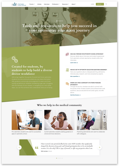
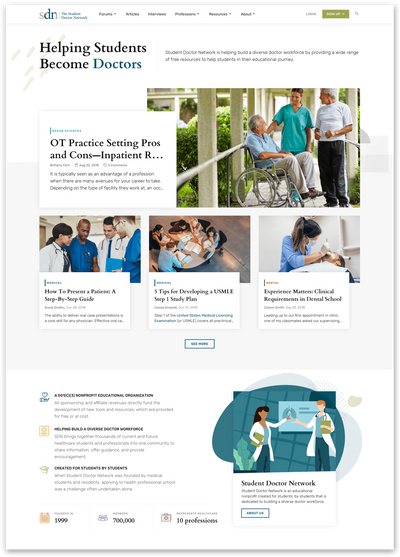
The key to the website design was adaptability. The new platform needed to scale well as the company continues to grow and expand their library of resources. Student Doctor Network had a variety of media types that we had to contend with such as blog articles, interviews, podcasts, resources, forum posts, and more. That meant the visuals needed to be flexible in structure with the different media types all while feeling approachable and reflecting how simple, yet powerful the website is to use.
custom iconography & illustration
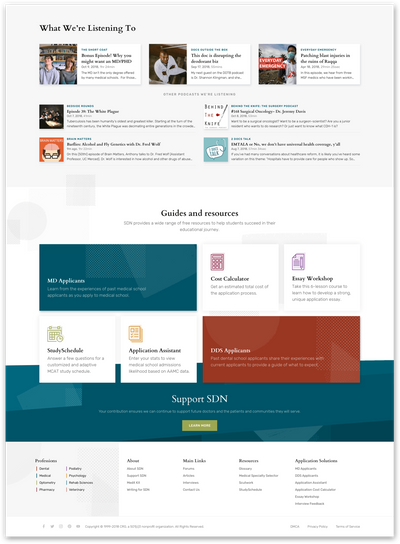
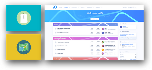
We crafted a custom set of icons for Student Doctor Network that would help identify their chosen medical fields and carry that story across the website and supporting media materials. Along with a custom icon set, we incorporated hand-drawn elements throughout the website to better communicate a lighthearted and approachable visual language.
development
bridging the gap
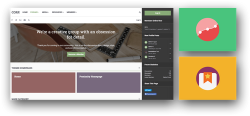
A unique challenge to this project was the software requirements. Student Doctor Network already offered an extensive medical resource library and an active community but wanted to offer Wiki articles as well. Our team was tasked with bridging three softwares; WordPress to handle their blog, XenForo to handle their community, and MediaWiki to handle their Wiki articles. The first roadblock we encountered was the need to develop our own system which had both advantages and disadvantages to it.
For one, it meant we had full control over the logic behind it, the data structure, and the extensibility of it. On the other hand, we weren’t able to take advantage of a battle-tested solution that would save us development time. The next challenge came when considering performance. We were attempting to pull in data from WordPress and MediaWiki into XenForo, a large undertaking that had considerable effect on the performance overall. We combatted the issue by adding API request caching and queueing large processing tasks into XenForo’s job system.
Knowing the ideal integration between content and community due to our expertise in online communities and a little development magic from our coding wizards —we were able to create a platform that provided a seamless, performant, and cohesive user experience across multiple software.
Thanks to the team at Audentio. Really appreciated their hard work on this project. They handled every aspect of the redesign professionally and beyond our expectations. Kudos!
