IGN
helping to modernize one of the internet's largest communities
overview
IGN has cemented itself for more than two decades as the leading site for all video game news and reviews and boasts an impressive community of nearly 130 million posts.
The community had outgrown their software and needed to level up the sophistication to better match their brand and quality. We were asked to help find the best solution moving forward, with a modern experience to support it, and of course a safe, secure, and accurate way to transfer their data to the new platform.
services
- ui/ux
- community development
- community strategy
- technology consulting
- data migration
early challenges
community platform
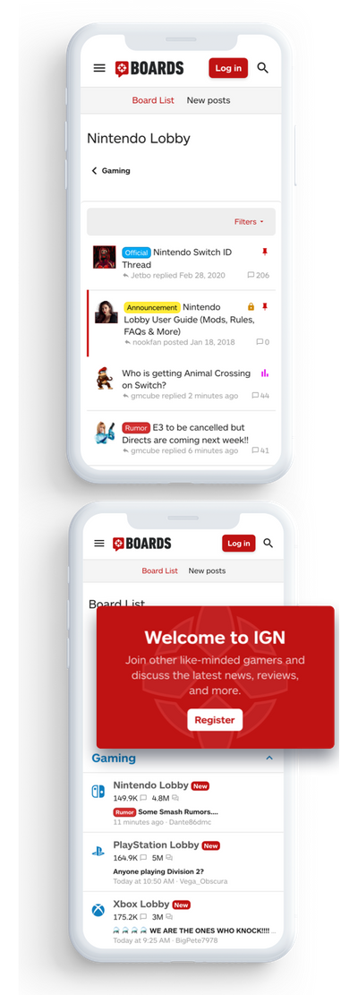
The platform and software that was being used when Audentio connected with IGN was deprecated by the developers, a software from the early 2010s. The process of designing and building out the new platform experience needed to be as seamless as possible so as to not interrupt users in any way; minimal downtime as well as an experience familiar to them. We decided to start with a few mockups to start painting a picture as well as a timeline and strategy document to map out the path forward.
Early on, it was clear that XenForo 2 would be an ideal software to upgrade to. We weighed out the options of considering other platforms but to make sure the experience was kept consistent and clean, we opted for the familiarity and power that is XenForo 2.
modern experience for a long-standing community
user experience
Mockups and design planning discussions were started as one of the earliest deliverables. Our creative director Nikki worked with many product designers at IGN to come up with a solid experience that was an enormous improvement, offered a modern experience, was more mobile friendly and responsive, while keeping the same vibes as you would want to with such a classic and iconic community.
ui.x pro
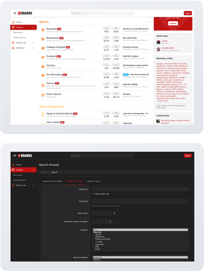
This product offers a material base and easy to customize UX that worked extremely well in getting IGN what they were looking for on the front-end. Developing our mock-ups using UI.X Pro was very convenient and adds tons of useful tools for the users.
[th] style switch
Offering a dark theme on communities these days is a must, especially with just about all major operating systems offering native tools to change contrast with light or dark theme options. This tool allows automatic detection of a user’s operating system level preference of dark vs light and automatically changes the theme accordingly.
The development of the design and tools into a front-end experience and integration into the community platform XenForo 2 was straightforward and something our company is known for excelling at.
setting the foundation for a successful data migration
tech challenges
First we started with some questions for ourselves:
- Were there any server configurations or anticipated roadblocks that IGN was aware of that we could familiarize ourselves with? What could we learn from the existing platform itself that might be very unique and require custom needs?
- This was the largest migration we had executed up until that point. Was there anything we can do to make optimizations to the overall process early on and log progress?
- How can we estimate the most accurate time from start to completion and an idea of how long the forum needs to be in read only mode?
- Were there any major concerns given the amount of data?
- Were there any unique solutions that we had to come up with?
our approach
After onboarding with IGN’s systems ops and devops and were given access, we consulted on the foundation and topology to get it properly configured and ready. We had a straightforward experience with the topology and strategy that was decided. The team at IGN was a breeze to work with and they have extremely talented engineers over there!
We did 3 tests before go-live. This made sure we were able to make subtle improvements to the migration script and fill out ever-more accurate expectations of downtime.
The go live day was very successful with minimal downtime. The forum sat in read-only mode so that ads were still delivering and users could catch up on their discussions if needed. Throughout the whole project, quality assurance and testing was done ongoing. After one final thorough run through, the switch was flipped and we went live!

We hired Audentio to build a strong user experience and handle the upgrade and migration for our (arguably) ancient community platform. We ended up with a new, slick look and fully responsive page that will allow for more consistency with our users. Audentio's deep knowledge of forum communities and XenForo's templates and plugins made the process quick and efficient. The test migrations and migration itself went smoothly, and required minimal follow up. We will be contacting Audentio in the future as we figure out what other improvements we'd like to make!


